You’ve heard the latest buzzword, BRANDING, and how important it is, but what brand design elements do you REALLY need when starting a new business? As a brand identity designer that has helped many companies get started online, I can tell you the 7 brand design elements that you need to have in your arsenal.
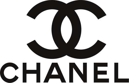
Chanel’s logo is an example of an iconic mark that’s withstood the test of time
Chanel’s logo is an example of an iconic mark that’s withstood the test of time
Logo
The majority of my clients come to me seeking a logo for their business. The logo is the first step for your brand identity package. It will dictate the look and feel of the rest of your branding. A logo is the absolute most important part of a branding package. It should be easy to recognize. It should appeal to your target audience (so be sure to that you choose a professional designer that does proper research on who you’re looking to attract!).
Most importantly, your logo will be on EVERYTHING, from business cards to letterheads, to your product packaging and website. It is what your customer will picture in their mind when they hear your business name. An experienced logo designer will do their due diligence to ensure that your logo is an accurate representation of your company.
Since your logo will be used in so many different places in print and on the web, you should have several different versions of your logo:
- Horizontally Oriented
- Square
- Single-color, white, black, and single branded color
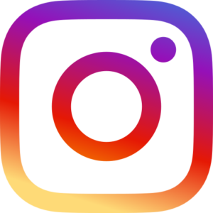
Instagram’s logo icon is bold and recognizable
Instagram’s logo icon is bold and recognizable
Logo Icon
A logo icon is a mark or symbol that is immediately recognizable as representing a brand. It can be an image, an arrangement of letters, a smaller or more simplified version of a logo. For example, think Apple or Nike. The brands have created logo icons that we can instantly picture in our minds. The logo mark should be in branded colors and bold enough to stand alone. In addition to color variations in your primary logo, it’s handy to have a few color variations to your logo icon as well.
Some examples of how logo icons can be used include:
- App icons
- Square versions for Social Media images
- As favicons on your website
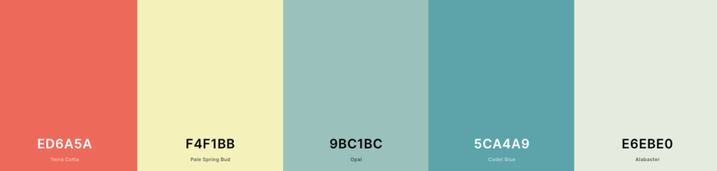
An example of a brand’s color palette. Created with coolors.co.
An example of a brand’s color palette. Created with coolors.co.
Color Palette
We all know that color can evoke certain emotions. For example, red evokes excitement. Blue represents trust. Yellow suggests optimism. Your brand’s colors are no different. Whether you stick with a strict color palette, or you like to explore a wider range of shades that represent your brand, be sure to choose your palette thoughtfully. Your branded colors need an RGB, CMYK, Pantone, and HEX code for each color. Not sure when and where to use each variation? Read more here.
Above all, establishing a consistent color palette evokes trust with your customers. In your brand design elements and at every touchpoint in your marketing you should use your branded colors in some way.
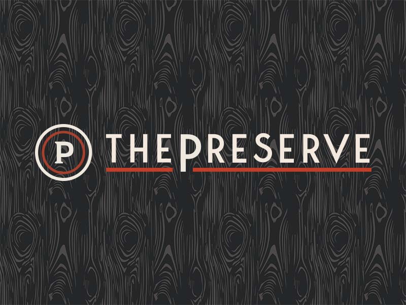
The Preserve uses a wood pattern as an accompanying brand element behind their logo
The Preserve uses a wood pattern as an accompanying brand element behind their logo
Patterns and Shape
Patterns are a playful way to integrate your branding across all that you do. It is okay to use more than one pattern or a set of shapes for your branding as long as they all feel cohesive and recognizable. A pattern can be as simple as your logo icon repeated in a fun way, or a brand element that’s placed on your website background with some transparency. In the above example, we used a texture from a tree. This works for this brand because we wanted the brand to have an outdoorsy, mountain feel. This is suggested by using the pattern from tree bark as a brand design element.
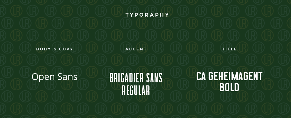
Fonts are very important brand design elements to include in your style guide
Fonts are very important brand design elements to include in your style guide
Fonts
Importantly, fonts are an incredibly crucial part of your brand design. Branded fonts should be used everywhere on your marketing collateral (except for web text, which sometimes is limited to certain web-safe fonts). A lot of the time, the font used in your logo will be your primary font. There should also be some fonts defined for headlines and body copy.
In the example above, we chose a web-safe font, Open Sans, for the company’s body and web copy. As an accent font, we chose Brigadier Sans Regular, and the titles for this brand should always be in CA Gehimagent Bold. These rules should be followed in all print and web design in order for the brand to feel consistent. Remember, consistency builds trust with your audience!
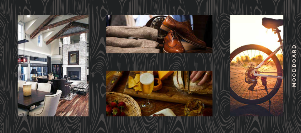
Mood boards should have consistent photography styles, lighting, and moods
Mood boards should have consistent photography styles, lighting, and moods
Mood Board
A mood board is a collection of images, colors, textures, and fonts that will tell the user how to ‘feel’ when experiencing your brand. Above all, the mood board is what makes a brand feel less like a company and more like a lifestyle by making it feel tangible. The images are complementary, in that they should have similar lighting and photography styles. The images must look cohesive when placed together. The viewer should be able to feel almost “in the moment” with the imagery.
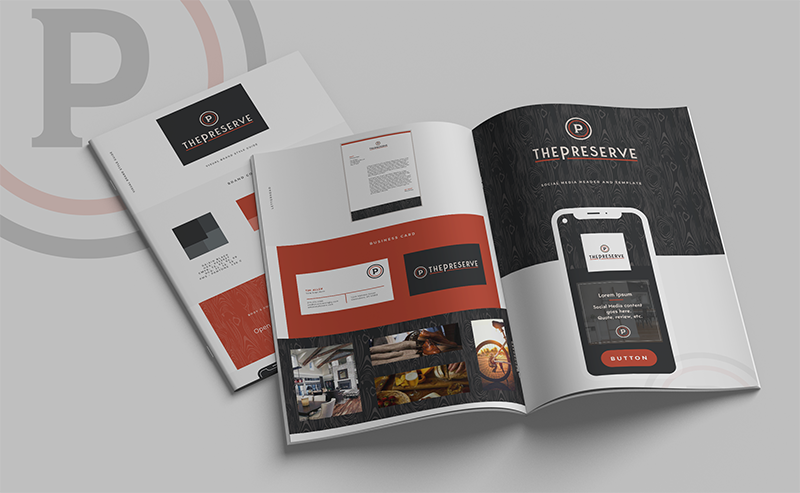
Your brand guideline is a straightforward guide to how to use your new brand in the real world
Your brand guideline is a straightforward guide to how to use your new brand in the real world
Keep all of your brand design elements in one place with Brand Guidelines
A brand guideline (also known as a style guide) is an essential deliverable when working with a designer to create your brand. It contains clear rules around your branding that ensure that your branding is used consistently. Essentially, it takes all of your other branding elements and displays them into a nice, visually appealing digital booklet to pass out to designers, writers, and other vendors that are working with your brand.
Elements in your brand guideline should include, but are not limited to:
- Logo Use guide (with variations)
- Color Palette
- Typography
- Image/Photography Guideline
Depending on which brand design service you’ve purchased from your vendor, you may wish to have more than these items in your branding kit. Make sure you communicate beforehand about your needs when searching for a rebrand, as each Agency/Designer’s services are a bit different. If you’re looking for a rebrand for an established business or a new brand package for a fresh company, contact me to inquire about my brand identity services.

Recent Comments