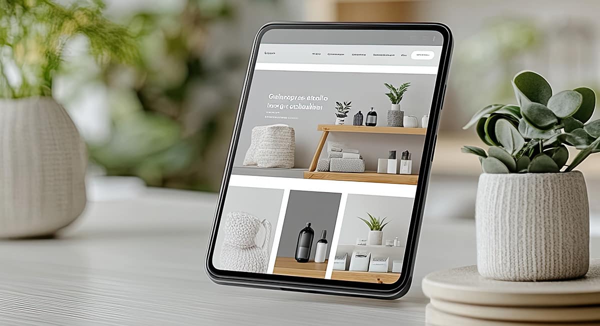
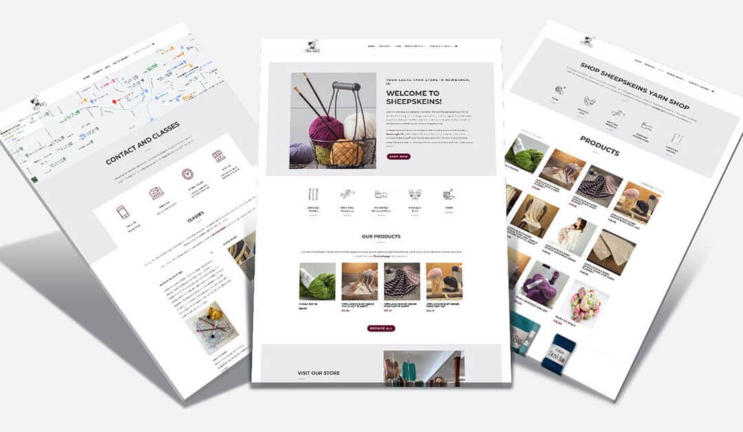
Let’s be real—your website is the face of your business online, and first impressions matter. Did you know that according to research by Stanford University, 75% of people make snap judgments about your business’s credibility just by looking at your website? That’s huge! In the competitive world of e-commerce, having a well-designed website could be the difference between a sale and a lost customer. As someone who’s been designing e-commerce websites for small businesses for years, I’ve seen firsthand how good design can drive sales and keep customers coming back.
Whether you’re thinking about giving your old e-commerce site a makeover or you’re planning to build a new one from scratch, I’m here to guide you. Let’s dive into some tips that will help you create a website that’s not just pretty to look at but also a powerhouse for sales.

Step 1: Prioritize E-Commerce UX Design
Ease of Navigation
Think of your website like a store—if people can’t find what they’re looking for, they’re probably going to walk out. A user-friendly navigation system is key to keeping your customers happy and engaged. When your site is organized logically with clear labels and easy-to-find sections (like the shopping cart and contact info), people are more likely to stick around and make a purchase. It’s all about making their shopping experience as smooth as possible. Improve user experience (UX) by following best practices to ensure that your visitors have a pleasant shopping experience on your site.
Mobile Responsiveness
Here’s the thing—over 50% of web traffic comes from mobile devices. So, if your e-commerce site isn’t mobile-friendly, you’re leaving money on the table. A responsive design ensures your site looks great and works well on any device, whether it’s a smartphone, tablet, or desktop. And guess what? Google loves mobile-friendly sites too, so it’s a win-win. Not sure if your website design is mobile-friendly? Let’s chat.
Loading Speed
Nobody likes waiting, especially online. If your website takes too long to load, potential customers might bounce before they even see what you have to offer. Speed up your site by compressing images, using a content delivery network (CDN), and cutting down on heavy scripts. Remember, even a one-second delay in loading time can hurt your sales, so it’s worth the effort to get that speed up.
Use tools like Pingdom’s Website Speed Test to gain insights on the page load time for your website. These tools run a speed test on your site and give it a score. They also break down the performance of your page and offer suggestions on where to improve the speed. Some common issues leading to decreased speed on e-commerce sites are:
- Too many HTTP requests
- URL Redirects
- Images are too large

Step 2: Optimize Product Pages
High-Quality Images
A picture’s worth a thousand words, right? High-quality images that show off your products from every angle can really make a difference. Customers want to know exactly what they’re buying, so investing in professional photography is a smart move. Just make sure those images are optimized for the web so they load quickly and don’t slow down your site.
Tools such as Tiny PNG help to compress images so they load more quickly on your site. Images should be sizes appropriately for their container on your site as well.
Detailed Descriptions
Your product descriptions should do more than just list the features—they should tell a story. Highlight what makes your products special, why they’re better than the competition, and how they’ll benefit your customers. And don’t forget to sprinkle in some SEO keywords to help people find your products in search engines.
Tools such as SEMRush or Google Keyword Planner are useful in finding the specific keywords that will help your site rank in search. Remember, SEO is a process!
Customer Reviews and Ratings
Let’s be honest—people trust other customers more than they trust marketing copy. That’s why displaying customer reviews and ratings on your product pages is so important. Encourage happy customers to leave reviews, and make sure those reviews are easy to find. Social proof can be the nudge someone needs to hit that “Buy Now” button.
Here are some suggestions on how to encourage customers to leave reviews:
- Use a product review plugin
- Offer a discount code, points, or freebie in exchange for positive reviews
- Send a follow up email to a past customer or client asking for a reivew

Step 3: Simplify the Checkout Process
Streamlined Checkout
The checkout process should be as simple and straightforward as possible. If it’s too complicated, people are going to abandon their carts. Keep the number of steps and form fields to a minimum, and use progress indicators so customers know how close they are to finishing their purchase. The easier you make it for them, the more likely they are to complete the transaction.
Multiple Payment Options
People like having choices, especially when it comes to payment. Offer a variety of payment methods—credit cards, PayPal, Apple Pay, whatever works for your customers. The more options you provide, the more comfortable people will feel about making a purchase.
Guest Checkout
Not everyone wants to create an account just to make a purchase, and that’s okay! Offering a guest checkout option can boost your conversion rate by removing that extra barrier. Keep it simple, ask for the essentials, and then give them the option to create an account after they’ve checked out.

Step 4: Enhance Visual Appeal
Consistent Branding
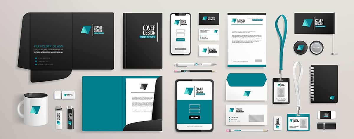
Your website should look and feel like your brand. Consistency in colors, fonts, and imagery helps build trust and makes your business look professional. When everything ties together, it not only looks good but also reinforces your brand identity, making you more memorable to customers.
Pro Tip: Don’t put the cart before the horse. Your branding should be finalized before you create your website. Your website designer will utilize your branding throughout your website. You should be able to provide a brand guide for your designer to follow. If you do not have one – contact me today for help!
Eye-Catching Call-to-Actions (CTAs)
CTAs are the buttons that make things happen on your site, so they need to stand out. Use colors that pop and action-oriented language like “Shop Now” or “Get Yours Today.” Place them strategically throughout your site to guide users toward making a purchase. The right CTA can turn a casual browser into a buyer.
Interactive Elements
Add some life to your product pages with interactive elements like image zoom, 360-degree views, and product videos. These features not only make your site more engaging but also give customers a better idea of what they’re buying. The more confident they feel about your product, the more likely they are to click “Add to Cart.”

Step 5: Implement SEO Best Practices
Keyword Research
To get your products in front of the right people, you need to know what they’re searching for. Conduct keyword research to find the terms your potential customers are using, and then strategically place those keywords in your product titles, descriptions, and meta tags. This will help your products show up in search results, driving more organic traffic to your site.
On-Page SEO
On-page SEO for E-Commerce websites is all about making your site as search-engine-friendly as possible. That means using relevant keywords, meta tags, and headers, as well as making sure your URLs are descriptive. Don’t forget to add alt text to all your images—this not only helps with SEO but also makes your site more accessible.
According to Harvard University’s digital accessibility team, alt text should describe just what the image contains, but also how the image relates to the content on your page.
Content Marketing
Creating valuable content is a great way to drive traffic to your site and boost sales. Blog posts, guides, and product videos can all attract new visitors and provide them with useful information. Share your content on social media to reach an even wider audience, and always keep your target customers in mind when crafting your content.

Step 6: Address Security and Trust
Security Measures
In the online world, trust is everything. Make sure your e-commerce site is secure by implementing SSL certificates, using secure payment gateways, and regularly updating your security protocols. Display trust badges and security seals prominently to reassure customers that their information is safe with you.
Fraud Prevention
Protect your business and your customers from fraud by using CVV checks, address verification, and monitoring for suspicious activity. A secure shopping experience not only builds trust but also keeps your reputation intact.

Step 7: Leverage Personalization
Personalized Shopping Experience
Personalization is key to making your customers feel special. Use data to tailor the shopping experience to each individual, whether it’s through personalized product recommendations, targeted email marketing, or custom content. The more relevant the experience, the more likely customers are to return and make a purchase.
Retargeting and Abandoned Cart Emails
Don’t let those abandoned carts go to waste! Use retargeting ads and follow-up emails to remind customers of the products they left behind. Throw in a discount or special offer to sweeten the deal and encourage them to complete their purchase.

Step 8: Focus on Customer Support
Integrated Customer Support
Providing top-notch customer support can make all the difference. Integrate live chat, AI chatbots, and a comprehensive FAQ section to help customers find answers quickly. The faster their questions are answered, the more likely they are to complete a purchase and become loyal customers.
Customer Loyalty Programs
Reward your repeat customers with a loyalty program. Not only do these programs encourage customer retention, but they also give you valuable insights into your customers’ shopping habits. Plus, who doesn’t love earning points or getting discounts for being a loyal customer?

Step 9: Make Accessibility a Priority
Website Accessibility
Your website should be accessible to everyone, including people with disabilities. This means adding alt text to images, ensuring your site is navigable by keyboard, and testing compatibility with screen readers. Not only does this make your site more inclusive, but it also improves your SEO.
Many website accessibility products exist online. These tools will actually test your website and let you know where you can improve. There are also many wordpress plugins available that help to improve your site.
The Web Accessibility Initiative website is a great place to start looking for tools.
Transparency and Ethical Practices
Being transparent about your business practices can go a long way in building trust with your customers. Clearly outline your return policy, shipping details, and contact information. Customers appreciate businesses that are open and honest, and they’re more likely to support brands that align with their values.
Conclusion
Creating a successful e-commerce website is a mix of art and science. It’s about understanding your customers’ needs and then designing an experience that meets those needs seamlessly. With these tips in your back pocket, you’re well on your way to turning your e-commerce site into a sales powerhouse. And remember, I’m here to help you every step of the way—whether it’s a complete redesign or just a few tweaks, let’s make your website the best it can be!
I have a full team of Web developers, SEO specialists, Copywriters, and Designers here to act as a full service agency. We’re here to help you and your e-commerce business succeed on the web.
Reach out to us today to improve your e-commerce site and start to boost sales!


Recent Comments